


In the previous post, Getting Started with Regression and Decision Trees, you learned how to use decision trees to create a regression model for predicting the number of bikes hired in a bike sharing scheme. You used the average temperature of a day to make the predictions. Now you will extend the model by also including humidity as a predictive element and learn how to use Cross-Validation to estimate the error of your model in order to compare the outcome of different decision trees.
Start by loading the data and training the model just as you did previously, except this time you also need to include the column 'humidity' in the training data:
import pandas as pd

from sklearn.tree import DecisionTreeRegressor

import numpy as np
bikes = pd.read_csv('bikes.csv')
 regressor = DecisionTreeRegressor(max_depth=2)
 regressor.fit(bikes[['temperature', 'humidity']], bikes['count'])
DecisionTreeRegressor(criterion='mse', max_depth=2, max_features=None,

           max_leaf_nodes=None, min_samples_leaf=1, min_samples_split=2,

           min_weight_fraction_leaf=0.0, presort=False, random_state=None,

           splitter='best')
You can compare the rules generated with the ones of the old model by exporting the two trees:
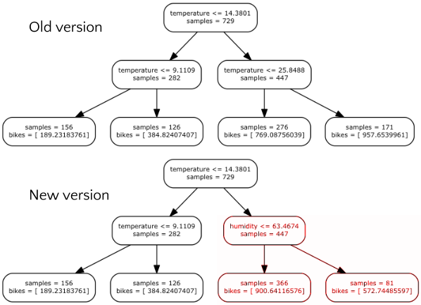
Trees comparison
Comparing this tree with the one from the last post you should notice that the left part of the tree is the same and is still only based on temperature, but the right part now uses humidity. This suggests that humidity may be a good predictor in cases of high temperature. In particular the model reflects the fact that people still cycle when temperature is high if the humidity is low. However, when humidity increases, they cycle less.
To better understand the meaning of the rules, let’s plot the number of bikes as function of temperature and humidity. First, let’s evaluate the regressor on a grid of points where temperature and humidity are combined:
nx = 30

ny = 30

# creating a grid of points

x_temperature = np.linspace(-5, 40, nx) # min temperature -5, max 40

y_humidity = np.linspace(20, 80, ny) # min humidity 20, max 80

xx, yy = np.meshgrid(x_temperature, y_humidity)

# evaluating the regressor on all the points

z_bikes = regressor.predict(np.array([xx.flatten(), yy.flatten()]).T)

zz = np.reshape(z_bikes, (nx, ny))
Here the function linspace is used to generate two lists of evenly spaced points, first of temperature then of humidity. After that, these two lists are combined using meshgrid, which generates a grid of all the combinations of the values. Finally, the result is passed to the regressor. You are now ready to visualise the result:
from matplotlib import pyplot as plt

%matplotlib inline
fig = plt.figure(figsize=(8, 8))
 # plotting the predictions
 plt.pcolormesh(x_temperature, y_humidity, zz, cmap=plt.cm.YlOrRd)
 plt.colorbar(label='bikes predicted') # add a colorbar on the right
 # plotting also the observations
 plt.scatter(bikes['temperature'], bikes['humidity'], s=bikes['count']/25.0, c='g')
 # setting the limit for each axis
 plt.xlim(np.min(x_temperature), np.max(x_temperature))
 plt.ylim(np.min(y_humidity), np.max(y_humidity))
 plt.xlabel('temperature')
 plt.ylabel('humidity')
 plt.show()
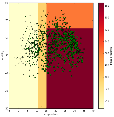
In this snippet the predictions are used to create a pseudocolor plot, and the real observations are overlaid on top of predictions to compare the two. The plot is as follows:
Space visualisation
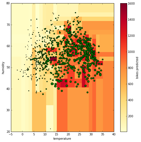
In this figure there is the temperature on the x axis and the humidity on the y axis. The background color represents the number of bikes predicted (the color bar on the right links the color the numeric value). The green bubbles represent the actual data and their size reflects the number of bikes hired. The bigger they are, the more bikes were hired. Comparing the size of the bubbles and the features individually, you see that the bikes hired increase when the temperature increases but you can’t find a clear relation with the humidity. Only one detail can be noticed, when humidity gets too high, the number of bikes drops and this is picked up by the regression tree shown above. By increasing the depth of the tree (we set it to 2 at the beginning using the ‘max_depth’ parameter), you can have more specific rules. Let’s plot again the predicted values using a Decision Tree with a depth of 100.
Space visualisation 2
Now you see that there are many different colors, not just four, and that the space is partitioned in many more sections. Visualising and interpreting the rules of this tree is now much harder but the feeling is that we have a model that fits the data very well. However, can we trust a tree with a depth of 100 compared to a tree with a depth of 2? To establish this, you need to compare the observed number of bikes hired with the predicted number of bikes using an error metric. There are many options (e.g. R2, MAPE, …) but to illustrate, let’s use the mean absolute error (MAE), which is easy to interpret since its value is in the same units as the target. It is defined as follows

MAE
This metric compares N predictions with the target value, returning an average. It is already implemented in sklearn:
from sklearn.metrics import mean_absolute_error

mean_absolute_error(bikes['count'], regressor.predict(bikes[['temperature', 'humidity']]))
<code>181.28165652686295</code>
From the result you can see that the error of the tree with 2 levels is on average 181 bikes per prediction. Let’s compute the error for a tree with 100 levels:
regressor_depth100 = DecisionTreeRegressor(max_depth=100)

regressor_depth100.fit(bikes[['temperature', 'humidity']], bikes['count'])

mean_absolute_error(bikes['count'], regressor_depth100.predict(bikes[['temperature', 'humidity']]))
<code>0.0</code>
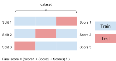
At a first glance it seems that the second tree is perfect, much better than the first one! Anyways, it is possible to argue that this error just reflects how much the model fits the data that you already have, and that doesn't tell you much about how the model will perform with data never observed before. Cross-Validation (CV) is a technique designed to address this problem. The idea behind CV is simple: the data are split into train and test sets several consecutive times and the averaged value of the prediction scores obtained with the different sets is the estimation of the error. In the following figure you can see an example of how CV works:
Cross Validation
In this example the data is split three times, and each time the model is trained and tested. This means that in the end there are three different scores. The average of these values is considered to be the final score. You can apply CV on the first regressor created (the one with depth=2) using the built-in function cross_val_score:
from sklearn.cross_validation import cross_val_score

scores = -cross_val_score(regressor, bikes[['temperature', 'humidity']],

bikes['count'], scoring='mean_absolute_error', cv=10)
This function returns the score obtained for each split (Note that the sign of the output of cross_val_scores is inverted because it uses a negative sign in case of metrics that can only be positive like the MAE). For example, we can check all the scores obtained with 10 splits:
<code class="sourceCode python">scores</code>
array([ 170.81419231,  184.34538921,  180.70727277,  293.31959372,

        207.95262785,  129.8914135 ,  338.78334798,  264.29533382,

        233.57114587,  242.93851741])
But the final estimation that we want is the given by the average:
<code class="sourceCode python">scores.mean()</code>
<code>224.66188344455881</code>
As you can see, the estimation done through CV is way less optimistic than the one obtained before. We went from from an error of around 180 to one which is around 225. But let’s see the error estimation using the tree with depth level equal to 100:
scores = -cross_val_score(regressor_depth100, bikes[['temperature', 'humidity']],

bikes['count'], scoring='mean_absolute_error', cv=10)

scores.mean()
<code>243.2683964358194</code>
It is much worse, very far from the perfection we estimated before! This is because this tree suffers from overfitting, it describes the training data very well but it will not have provide a good prediction when we use it with data that was not present in the training set. In the end, comparing the score of the two models you can tell that the simpler tree beats the complex one.
A recap of what you learnt in this post:
- Decision trees can be used with multiple variables.
- The deeper the tree, the more complex its prediction becomes.
- A too deep decision tree can overfit the data, therefore it may not be a good predictor.
- Cross validation can be used to estimate the error and avoid overfit.
- The error estimation can be used to compare different regression models in order to choose the most appropriate one.
Here is the notebook with the code and the data.
ABOUT THE AUTHOR

Giuseppe Vettigli
Giuseppe is a Data Scientist who has worked in both academia and the research industry for many years. His work focuses on the development of machine learning models and applications to make inferences from both structured and unstructured data. He also writes a blog about scientific computing and data visualization in Python: http://glowingpython.blogspot.com.