


A crucial step of any machine learning attempt is getting a good impression of your dataset. Exploratory data analysis (or EDA) is one way to do this. It consists of summarizing the data with descriptive statistics and often involves extensive plotting. The web is full of plotting libraries that help with this task and more recently, the resulting plots have become interactive.
One such interactive plotting library is Plotly and it offers very intuitive ways to display data and make it interactive. Furthermore it can be used though a variety of platforms, i.e. it can be used with Python, JavaScript, R and others. Crucially, it has recently been made open source, which now enables plotting without requiring access to their API.
In the following post, I will show how to build a scatter plot matrix that is "spiked" with some boxplots to highlight some useful statistics. I will proceed step by step. First I will explain how to prepare the dataset for plotting. Then I'll explain how to plot a scatterplot and a boxplot using basic plotly syntax. Finally, I'll show you how to put all the pieces together to build the final plot. If you want to jump straight to the plotting, just skip the Getting to know the dataset and Simplification of the datasetsections and go to Isolated Scatterplot.
Throughout this post we will be using a couple of libraries that first need to be installed. The libraries make some tasks more convenient, such as the loading of the data (pandas) and numerical processing (numpy). Then we also need to install Plotly (plotly) and a library for neater selection of colour schemes (colorlover). If they are not installed on your machine, start by installing pip. Then, in a terminal, type
pip install plotly

pip install colorlover
Furthermore, we will need to load a dataset that we want to explore. I have picked a classic: the red wine dataset from Paulo Cortez, which can be downloaded from here. Just unzip the file into your current working directory and look for the winequality-red.csv file.
Getting to know the dataset
Let us start to explore the dataset by loading it into our python session with pandas.
#library to load the dataset and to make table manipulation more convenient

import pandas as pd
#the delimiter is the character that separates columns
 df = pd.read_csv('./winequality-red.csv', delimiter = ";")
To get an impression of the dataset we can quickly check how large it is in terms of number of columns and rows. The shape command is very convenient for this. We have 12 columns and 1599 rows. This is good to know so we can already plan the types of visualisations that could cope with these amounts of data, or whether the data should be aggregated or summarised in some way to facilitate visualisation.
<code class="sourceCode python">df.shape <span class="co">#get an impression how large the dataset is</span></code>
<code>(1599, 12)</code>
Another way to have a peak is to show the head of the table with head(). This is very useful as we can immediately see what the columns and rows correspond to.
<code class="sourceCode python">df.head()</code>
| fixed acidity | volatile acidity | citric acid | residual sugar | chlorides | free sulfur dioxide | total sulfur dioxide | density | pH | sulphates | alcohol | quality | |
|---|---|---|---|---|---|---|---|---|---|---|---|---|
| 0 | 7.4 | 0.70 | 0.00 | 1.9 | 0.076 | 11 | 34 | 0.9978 | 3.51 | 0.56 | 9.4 | 5 |
| 1 | 7.8 | 0.88 | 0.00 | 2.6 | 0.098 | 25 | 67 | 0.9968 | 3.20 | 0.68 | 9.8 | 5 |
| 2 | 7.8 | 0.76 | 0.04 | 2.3 | 0.092 | 15 | 54 | 0.9970 | 3.26 | 0.65 | 9.8 | 5 |
| 3 | 11.2 | 0.28 | 0.56 | 1.9 | 0.075 | 17 | 60 | 0.9980 | 3.16 | 0.58 | 9.8 | 6 |
| 4 | 7.4 | 0.70 | 0.00 | 1.9 | 0.076 | 11 | 34 | 0.9978 | 3.51 | 0.56 | 9.4 | 5 |
In this case, every row represents a wine and the different columns (with the last column being an exception) are features describing the wines. All these columns are numerical. The last column defines the quality of the individual wines with a score. To further refine our initial impression we can use the describe method to get useful summary statistics on a per-column basis. The statistics are indicated neatly as rownames.
<code class="sourceCode python">df.describe()</code>
| fixed acidity | volatile acidity | citric acid | residual sugar | chlorides | free sulfur dioxide | total sulfur dioxide | density | pH | sulphates | alcohol | quality | |
|---|---|---|---|---|---|---|---|---|---|---|---|---|
| count | 1599 | 1599 | 1599 | 1599 | 1599 | 1599 | 1599 | 1599 | 1599 | 1599 | 1599 | 1599 |
| mean | 8.319 | 0.527 | 0.270 | 2.538 | 0.087 | 15.874 | 46.467 | 0.996 | 3.311 | 0.658 | 10.422 | 5.636 |
| std | 1.741 | 0.179 | 0.194 | 1.409 | 0.047 | 10.460 | 32.895 | 0.001 | 0.154 | 0.169 | 1.0656 | 0.807 |
| min | 4.600 | 0.120 | 0.000 | 0.900 | 0.012 | 1.0000 | 6.0000 | 0.990 | 2.740 | 0.330 | 8.4000 | 3.000 |
| 25% | 7.100 | 0.390 | 0.090 | 1.900 | 0.070 | 7.0000 | 22.000 | 0.995 | 3.210 | 0.550 | 9.5000 | 5.000 |
| 50% | 7.900 | 0.520 | 0.260 | 2.200 | 0.079 | 14.000 | 38.000 | 0.996 | 3.310 | 0.620 | 10.200 | 6.000 |
| 75% | 9.200 | 0.640 | 0.420 | 2.600 | 0.090 | 21.000 | 62.000 | 0.997 | 3.400 | 0.730 | 11.100 | 6.000 |
| max | 15.90 | 1.580 | 1.000 | 15.50 | 0.611 | 72.000 | 289.00 | 1.003 | 4.010 | 2.000 | 14.900 | 8.000 |
Unfortunately this is not very useful for understanding the quality column. What we want is to see the different quality scores that wine can take. This can be achieved with the following command:
<code class="sourceCode python">pd.unique(df.quality.ravel())</code>
<code>array([5, 6, 7, 4, 8, 3])</code>
Here ravel() will flatten the column into an array from which then all duplicate values are removed with unique. This gives us an array that tells us that wine quality scores range from 3-8. Hence the quality can take one of 6 values; this is good to know as we could use six easily distinguishable colors to represent the wines quality scores.
Depending on what we want to do with the dataset we have now many choices. Given the "classes" of wines, it would be interesting to try to understand what makes a good and a bad wine. Here I will look into trying to visually distinguish the different classes of wine based on the different columns that describe them. To simplify this task I will first simplify the dataset.
Simplification of the dataset
In order to get a high level impression of the dataset, I will reduce its complexity. To achieve this, I will reduce the quality score classes from 6 to only 2, i.e. one class for class 1 wines (6-8) and one for class 0 wines (3-5). This is done by going over the quality column, evaluating at each quality score whether it is 6 or higher (inclusive) and then replacing the quality by 1 if it is the case and 0otherwise. We assign this then to a new column called quality_bin, for binary quality.
We do this conveniently with a lambda function that is applied to a colum with apply. A lambdafunction is very similar to a function.
df['quality_bin'] = df.quality.apply(lambda x: 1 if x >= 6 else 0)

quality_classes = pd.unique(df.quality_bin.ravel())

print(quality_classes)
<code>[0 1]</code>
For faster processing of the data and faster plotting, we will also reduce the number of wines that we inspect at the same time. To do this, we will sample a random subset of the wines; in this case we will only look at 100.
#load dataset and take a subset for faster data processing

df_sample = df.sample(n = 100)

df_sample.head()| fixed acidity | volatile acidity | citric acid | residual sugar | chlorides | free sulfur dioxide | total sulfur dioxide | density | pH | sulphates | alcohol | quality | quality bin | |
|---|---|---|---|---|---|---|---|---|---|---|---|---|---|
| 267 | 7.9 | 0.350 | 0.46 | 3.6 | 0.078 | 15 | 37 | 0.997 | 3.35 | 0.86 | 12.8 | 8 | 1 |
| 1490 | 7.1 | 0.220 | 0.49 | 1.8 | 0.039 | 8 | 18 | 0.993 | 3.39 | 0.56 | 12.4 | 6 | 1 |
| 650 | 10.7 | 0.430 | 0.39 | 2.2 | 0.106 | 8 | 32 | 0.998 | 2.89 | 0.50 | 9.6 | 5 | 0 |
| 589 | 10.2 | 0.290 | 0.49 | 2.6 | 0.059 | 5 | 13 | 0.997 | 3.05 | 0.74 | 10.5 | 7 | 1 |
| 396 | 6.6 | 0.735 | 0.02 | 7.9 | 0.122 | 68 | 124 | 0.999 | 3.47 | 0.53 | 9.9 | 5 | 0 |
Isolated Scatterplot
If you just start the tutorial from here, make sure to run the following few commands to load the dataset and simplify it first.
import pandas as pd #library to load the dataset and to make table manipulation more convenient

df = pd.read_csv('./winequality-red.csv', delimiter = ";") #the delimiter is the character that separates columns

df['quality_bin'] = df.quality.apply(lambda x: 1 if x >= 6 else 0)

quality_classes = pd.unique(df.quality_bin.ravel())

df_sample = df.sample(n = 100)
Plotly works with traces. Traces are dictionaries that contain both the data of a plot, as well as instructions on how to format it. Let's generate one of these traces to examine what they are made out of. First, we load the plotly library and from within it some of the plots types that we want to generate, i.e. Scatter for scatter plots and Box for boxplots. (Note: the py.offline.init_notebook_mode() line is required to generate plots when not accessing their API with your registered credentials).
import plotly #load plotly for plotting

import plotly.plotly as py

from plotly import tools

from plotly.graph_objs import * #all the types of plots that we will plot here

plotly.offline.init_notebook_mode() # run at the start of every ipython notebook
Then we pick two wine features that we want to assess for how they are related. Here I picked "pH"and "chlorides". To generate the scatter trace, we run the Scatter function.
#pick two featues

f1 = "pH"

f2 = "chlorides"
scatter_plot_trace = Scatter(
x = df_sample[f1].values, #feature 1
y = df_sample[f2].values, #feature 2
mode = "markers",
marker = dict(
size = 4
)
)
print(scatter_plot_trace)
{'marker': {'size': 4},

 'y': array([ … ])

 'type': 'scatter',

 'mode': 'markers',

 'x': array([ … ])}
For example, this scatterplot contains a series of items including 'type' that is set to 'scatter' and 'mode' that is set to 'markers' to tell plotly to do a scatter plot with points (or markers - as opposed to lines). Then along with the 'markers' mode, it contains an item 'marker' which itself is a dictionary that contains the instructions of how to style the individual markers; here they are set to 'size = 4'. Finally, the trace contains the data in the 'x' and 'y' items, which together define the coordinates of the points. Thus, each trace is a self contained plotting unit composed of both the formatting information and the data itself.
To visualise the trace, we first need to place it into a list; usually we have more than one trace that we want to plot and therefore they need to be housed in a list. Finally we create a figure dictionary where the traces list is assigned to the 'data' item. The figure can then be visualised.
traces = [] #the list to fill with trace dictionaries

traces.append(scatter_plot_trace)
fig = dict(data = traces)
 plotly.offline.iplot(fig)
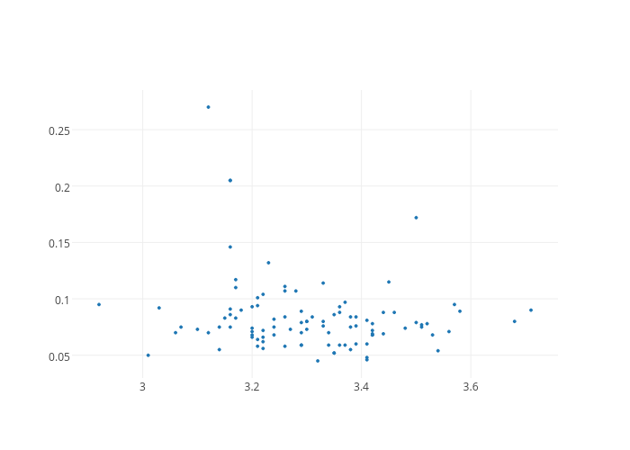
This gives us our first Plotly plot (Note: click on the plot to view it interactively - it is hosted on www.plot.ly). Although it is very bare-bones, it already comes with interactivity; when hovering over the individual points, it highlights the coordinates in tooltips. However, we want to do better than this. For instance, we would to at the very least like add axis titles. To achieve this, we need to build a layout dictionary.
scatter_plot_layout = Layout(

    xaxis = dict(

        title = f1

    ),

    yaxis = dict(

        title = f2

    )

)
print(scatter_plot_layout)
<code>{'xaxis': {'title': 'pH'}, 'yaxis': {'title': 'chlorides'}}</code>
As we can see, this builds just another dictionary with items that are informative, in this case the feature names. To display them on the plot, we have to modify the figure dictionary and add a layout item; note that it is not a list. Then we can replot.
fig = dict(data = traces, layout = scatter_plot_layout)

plotly.offline.iplot(fig)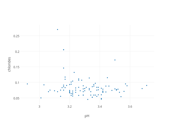
This is already better. However, this does not help to distinguish between the different wine classes. It would be good to color the individual wine points according to their class.
Coloured Scatterplot
In order to do this we can use the following customised colored_Scatter function. It repeats exactly the same code as above, but this time it will generate two traces, one for each class of wines by iterating over the classes with i, once for good wines, once for worse wines. First, we load the function.
def colored_Scatter(data, classes, f1, f2, color_scale, class_column):

    traces = []

    for i in range(len(classes)):

        idx = data[class_column] == classes[i]

        traces.append(

            Scatter(

                x=data[idx][f1].values, #feature 1

                y=data[idx][f2].values, #feature 2

                opacity=0.7, #for clearer visualisation

                mode="markers",

                name="class {}".format(classes[i]),

                marker=dict(

                    size=4,

                    color=color_scale[i]

                )

            )

        )

    return traces
Then we can call it with the necessary parameters: data - the table, classes - the unique wine classes in the quality_bin column, f1 and f2 for the two features and color_scale for the color scheme we want to assign to the different classes of wine. We also need to specify the name of the column with the classes, here quality_bin.
import colorlover as cl #load nicer color schemes

colors = (len(quality_classes) if len(quality_classes) > 2 else '3')

color_scale = cl.scales[str(colors)]['qual']['Set1'] #define color scale
scatter_plot_traces = colored_Scatter(
data = df_sample,
classes = quality_classes,
f1 = f1,
f2 = f2,
color_scale = color_scale,
class_column = "quality_bin"
)
print(scatter_plot_traces)
[{'opacity': 0.7, 'name': 'class 0', 'y': array([ … ]), 'mode': 'markers',

  'marker': {'color': 'rgb(228,26,28)', 'size': 4}, 'x': array([ … ]),

  'type': 'scatter'

 },

 {'opacity': 0.7, 'name': 'class 1', 'y': array([ … ]), 'mode': 'markers',

  'marker': {'color': 'rgb(55,126,184)', 'size': 4}, 'x': array([ … ]),

  'type': 'scatter'

 }

]
When inspecting the scatter_plot_traces we can first of all see that we have a list of dictionaries. The colored_Scatter function has generated one trace for each class of wine, and then put them together in a list. We can also see some new items in the individual traces, i.e. 'name' which records the class of the wines, and within the marker dictionaries 'color', these can be found with a different RGB code for each wine class.
fig = dict(data = scatter_plot_traces, layout = scatter_plot_layout)

plotly.offline.iplot(fig)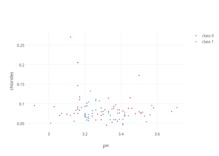
This is already better. The legend on the top right is displayed by default. Now we are ready to take things further. We could now repeat this process for many combinations of wine features. However, instead plotting one scatterplot at time, we can combine several into a matrix called a scatterplot matrix.
Building a Scatterplot Matrix
Let us first choose the features that we want to compare simultaneously.
features = ["pH", "chlorides", "sulphates", "alcohol"]

N = len(features)
As we building multiple scatterplots into one big plot, we will rely on making many subplots. Plotly has a relatively straightforward way of dealing with this scenario. What we want to do first is to determine the position of the different scatterplots in the matrix. We could just plot all features against each other, but this would include the features against themselves. This would result in relatively uninformative straight lines of points. For now we want to leave these regions empty and later insert more informative boxplots. So for now, we want to take all the combinations of features, excluding features against themselves. One way of doing this is to use all permutations of the features.
#load itertools to make permutations

import itertools

plot_positions = list(itertools.permutations(range(N), 2))

print(plot_positions)
<code>[(0, 1), (0, 2), (0, 3), (1, 0), (1, 2), (1, 3), (2, 0), (2, 1), (2, 3), (3, 0), (3, 1), (3, 2)]</code>
This gives the positions of the different scatterplots in the matrix. We will iterate over this list to generate one plot at a time.
scatter_plot_traces = []
for c in range(len(plot_positions)):
 i, j = plot_positions[c]
 sub_scatter_plot_traces = colored_Scatter(
 data = df_sample,
 classes = quality_classes,
 f1 = features[i],
 f2 = features[j],
 color_scale = color_scale,
 class_column = "quality_bin"
 )
 for k in range(len(sub_scatter_plot_traces)):
 sub_scatter_plot_traces[k]["xaxis"] = "x"+(str(i+1) if i!=0 else '')
 sub_scatter_plot_traces[k]["yaxis"] = "y"+(str(j+1) if j!=0 else '')
 scatter_plot_traces = scatter_plot_traces + sub_scatter_plot_traces
There is nothing unexpected in the first part of the loop.
However, once the colored_Scatter function is called for a given position in the scatterplot matrix, we need to make sure that the generated traces are assigned to the right axes, since we are going to have more than one. So that there are no mixups, each trace is assigned an 'axis' item that is set to x, x2, x3, x4, etc. in the case of the xaxis and y, y2, y3, y4, etc. in the case of the yaxis. (Note: there is no x1 or y1)
The axes are, as before, defined in more detail in the layout dictionary. It is here that a correspondence between the traces and the axes is established so that there is a match for each trace to the fitting axis of the scatterplot matrix. Furthermore, the domain of each axis needs to be defined. The domain indicates the fractional amount of space a subplot has in the scatterplot matrix.
def calcDomain(index, N, pad):

    return [index*pad+index*(1-(N-1)*pad)/N, index*pad+((index+1)*(1-(N-1)*pad)/N)]
plot_domains = [calcDomain(i, N, pad = 0.02) for i in range(N)]
 print(plot_domains)
<code>[[0.0, 0.235], [0.255, 0.49], [0.51, 0.745], [0.7649999999999999, 1.0]]</code>
The above function will split the space of the scatterplot matrix into even portions, one scatterplot for each feature that is included. Furthermore, it adds some padding between the individual subplots.
scatter_plot_layout = {}
for i in range(N):
 scatter_plot_layout['xaxis' + (str(i+1) if i!=0 else '')] = {
 'domain': plot_domains[i],
 'title': features[i],
 'zeroline': False,
 'showline': False
 }
 scatter_plot_layout['yaxis' + (str(i+1) if i!=0 else '')] = {
 'domain': plot_domains[i],
 'title': features[i],
 'zeroline': False,
 'showline':False,
 'position': 1, #set axis to the right of the scatterplot matrix
 'side': 'right'
 }
In this part, we establish the correspondence between the axes in the traces and the axes defined in the layout. In the layout dictionary of each subplot, its x- and yaxis are named 'xaxis', 'xaxis2', 'xaxis3', 'xaxis4', etc. and 'yaxis', 'yaxis2', 'yaxis3', 'yaxis4', etc. to match up with x, x2, x3, x4, etc. and and y, y2, y3, y4, etc., respectively. Furthermore, the subplot domains and axes titles are set here.
As a preference, I have set the yaxis labels on the right side of the plot; this is assigned through the 'position' item at 1, which corresponds to the scale of the plot_domains, i.e. 1 is at the very right. The 'side' item is required to make the label appear on the right side of the position that is defined.
We can have a quick look at what the plot would look like at this stage.
fig = dict(data = scatter_plot_traces, layout = scatter_plot_layout)

plotly.offline.iplot(fig)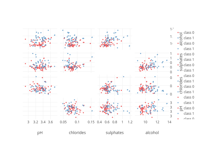
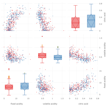
At first glance it is shaping up, but there are some quirks such as the grid lines in the bottom left subplot and the many legend entries. We will take care of them later, let us first build the boxplots that will be subplots at positions on the diagonal.
Isolated Boxplots
Boxplots are a compact and visual way to display distributions and make comparisons straighforward. The different vertical segments in the boxplot represent different statistics of the distribution. The start and end of the boxes indicate the 1st and 3rd quartiles (Q1 and Q3). Quartiles are the points at which a dataset is split into four equally sized parts. The 2nd quartile (Q2) is the median. Furthermore the boxplot has whiskers that correspond to the ranges leading up to Q1 and away from Q3 1.5 times the interquartile range (IQR = Q3-Q1).
In a very similar way to before, I have written a custom function colored_Box that will build a separate trace based on the classes in assigning a different color and name.
Some additional parameters ensure that the boxplot shows outliers with boxpoints = 'suspectedoutliers', colouring them as specified in the marker dictionary with outliercolor. Furthermore, the mean (rather than only the median), and its standard deviation is shown with the boxmean = 'sd' setting. The mean is indicated by a dashed horizontal line and the sdis shown as with a dashed line diamond.
Notice also the boxplot only takes one feature at a time.
def colored_Box(data, classes, f1, color_scale, class_column):

    traces = []

    for i in range(len(classes)):

        idx = data[class_column] == classes[i]

        class_trace = Box(

            y = data[idx][f1].values,

            name="class {}".format(classes[i]),

            boxpoints='suspectedoutliers',

            boxmean='sd',

            marker=dict(

                color=color_scale[i],

                outliercolor='rgba(255, 221, 23, 0.6)',

            )

        )

        traces.append(class_trace)

    return traces
Again, we can call the colored_Box function with its required parameters to see what a boxplot looks like.
box_plot_traces = colored_Box(

    data = df_sample,

    classes = quality_classes,

    f1 = f1,

    color_scale = color_scale,

    class_column = "quality_bin"

)
The boxplot traces are very similar in their makeup to the scatterplots, differing most importantly by their type; you can look into them with print(box_plot_traces) as before.
fig = dict(data = box_plot_traces)

plotly.offline.iplot(fig)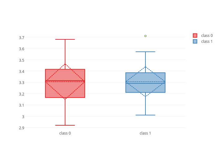
Plotly's interactivity highlights the boxplot statistics as we hover over them.
Putting it all together
Now we will generate all of the boxplots traces for the different classes and features before integrating them into the scatterplot matrix.
box_plot_traces = []
for i in range(N):
 sub_box_plot_traces = colored_Box(
 data = df_sample,
 classes = quality_classes,
 f1 = features[i],
 color_scale = color_scale,
 class_column = "quality_bin"
 )
 for k in range(len(sub_box_plot_traces)):
 sub_box_plot_traces[k]['xaxis'] = "x" + str(i+N+1) #we add N to we make sure we define new x-axes
 sub_box_plot_traces[k]['yaxis'] = "y" + (str(i+1) if i!=0 else '') #these have to match up with the y-axes
 box_plot_traces = box_plot_traces + sub_box_plot_traces
It is important here to generate new x-axes for the boxplots whilst making sure the y-axes are shared with those of the scatterplots. In the code we build new x-axes in adding the number of features (N).
box_plot_layout = {}
for i in range(N):
 box_plot_layout['xaxis' + str(i+N+1)] = {
 'domain': plot_domains[i],
 'position': plot_domains[i][1],
 'side': 'top',
 'showticklabels': False
 }
Then we adjust the boxplots' layout by defining their new x-axes and associating them with the traces. We also set their domains to the correct place in the scatterplot matrix. Furthermore, we have to adjust their positions in order to not overlap with the x-axes that exist already as this would break them. This is achieved jointly by setting the position to be above the plots with the 'position' argument and the 'side' argument to be on 'top'. As the colour already represents the different wine classes, we do not need the tick labels ('showticklabels': False).
Finally, we can set some general dimensions to the scatterplot matrix and give it a title.
general_layout = {

    'title': 'Scatterplot Matrix',

    'height': 850,

    'showlegend': False,

    'width': 850

}
What is very convenient is that we can simply add the boxplot traces to the traces list and Plotly will understand how to represent it as all the necessary information is contained. The same goes for the layout.
traces = scatter_plot_traces + box_plot_traces

layout = dict(scatter_plot_layout.items() + box_plot_layout.items() + general_layout.items())
fig = dict(data = traces, layout = layout)
 plotly.offline.iplot(fig)
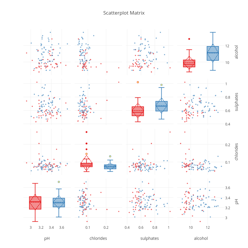
From this plot, we can see that sulphates and alcohol content seem to be two good features that help to distinguish good from worse wines. The interactivity of the plot and the sharing of the axes makes it possible to manipulate the plot to show regions of particular interest. The combinations of plots, and the fact that they are linked to each other makes each more valuable than if it were in isolation.
Armed with this tool, a next step could also be to clean up the data and then apply machine learning algorithms to statistically distinguish between the different quality wines. During the machine learning stages it will always be very useful to check the initial visual impression of the dataset to be confident that the results make sense. Of course, there are many more plots that we could do to explore the data further and gain more insights, but this is where I will stop for now.
(Note: The code above is not limited to visualising four features at a time distinguishing between 2 different classes; depending on the dataset that is submitted, the plot will automatically adjust the colors for the classes and the subplot dimensions if more features are tested.)
Want to learn more? Check out our two-day Data Science Bootcamp.
Below is the complete code (it can also be found on https://github.com/cnjr2/plotly_scatterplot_matrix):
def scatterplot_matrix_boxed(data, classes, features, padding, color_scale, class_column = "quality"):

    #import packages

    import itertools

    import plotly #load plotly for plotting

    import plotly.plotly as py

    from plotly import tools

    from plotly.graph_objs import Scatter, Box, Layout #all the types of plots that we will plot here

    plotly.offline.init_notebook_mode() # run at the start of every ipython notebook

    #grid layout of the scatterplot matrix

    N = len(features)

    plot_positions = list(itertools.permutations(range(N), 2))

    plot_domains = [calcDomain(i, N, pad = padding) for i in range(N)]

    #build the scatterplot traces

    scatter_plot_traces = []

    for c in range(len(plot_positions)):

        i, j = plot_positions[c]

        sub_scatter_plot_traces = colored_Scatter(

            data = data,

            classes = classes,

            f1 = features[i],

            f2 = features[j],

            color_scale = color_scale,

            class_column = class_column

        )

        for k in range(len(sub_scatter_plot_traces)):

            sub_scatter_plot_traces[k]["xaxis"] = "x"+(str(i+1) if i!=0 else '')

            sub_scatter_plot_traces[k]["yaxis"] = "y"+(str(j+1) if j!=0 else '')

        scatter_plot_traces = scatter_plot_traces + sub_scatter_plot_traces

    #build the scatterplot layout

    scatter_plot_layout = {}

    for i in range(N):

        scatter_plot_layout['xaxis' + (str(i+1) if i!=0 else '')] = {

            'domain': plot_domains[i],

            'title': features[i],

            'zeroline': False,

            'showline': False

        }

        scatter_plot_layout['yaxis' + (str(i+1) if i!=0 else '')] = {

            'domain': plot_domains[i],

            'title': features[i],

            'zeroline': False,

            'showline':False,

            'position': 1, #set axis to the right of the scatterplot matrix

            'side': 'right'

        }

    #build the boxplot traces

    box_plot_traces = []

    for i in range(N):

        sub_box_plot_traces = colored_Box(

            data = data,

            classes = classes,

            f1 = features[i],

            color_scale = color_scale,

            class_column = class_column

        )

        for k in range(len(sub_box_plot_traces)):

            sub_box_plot_traces[k]['xaxis'] = "x" + str(i+N+1) #we add N to we make sure we define new x-axes

            sub_box_plot_traces[k]['yaxis'] = "y" + (str(i+1) if i!=0 else '') #these have to match up with the y-axes

        box_plot_traces = box_plot_traces + sub_box_plot_traces

    #build the boxplot layout

    box_plot_layout = {}

    for i in range(N):

        box_plot_layout['xaxis' + str(i+N+1)] = {

            'domain': plot_domains[i],

            'position': plot_domains[i][1],

            'side': 'top',

            'showticklabels': False

        }

    #set the general lyout

    general_layout = {

        'title': 'Scatterplot Matrix',

        'height': 850,

        'showlegend': False,

        'width': 850

    }

    #combine taces and layout

    traces = scatter_plot_traces + box_plot_traces

    layout = dict(scatter_plot_layout.items() + box_plot_layout.items() + general_layout.items())

    fig = dict(data = traces, layout = layout)

    return fig
def calcDomain(index, N, pad):
return [index*pad+index*(1-(N-1)*pad)/N, index*pad+((index+1)*(1-(N-1)*pad)/N)]
def colored_Scatter(data, classes, f1, f2, color_scale, class_column):
traces = []
for i in range(len(classes)):
idx = data[class_column] == classes[i]
traces.append(
Scatter(
x=data[idx][f1].values, #feature 1
y=data[idx][f2].values, #feature 2
opacity=0.7, #for clearer visualisation
mode="markers",
name="class {}".format(classes[i]),
marker=dict(
size=4,
color=color_scale[i]
)
)
)
return traces
def colored_Box(data, classes, f1, color_scale, class_column):
 traces = []
 for i in range(len(classes)):
 idx = data[class_column] == classes[i]
 class_trace = Box(
 y = data[idx][f1].values,
 name="class {}".format(classes[i]),
 boxpoints='suspectedoutliers',
 boxmean='sd',
 marker=dict(
 color=color_scale[i],
 outliercolor='rgba(255, 221, 23, 0.6)',
 )
 )
 traces.append(class_trace)
 return traces
#reload the dataset

df = pd.read_csv('./winequality-red.csv', delimiter = ";")

df_sample = df.sample(n = 500)
quality_classes = pd.unique(df_sample.quality.ravel())
import colorlover as cl #load nicer color schemes
colors = (len(quality_classes) if len(quality_classes) > 2 else '3')
color_scale = cl.scales[str(colors)]['qual']['Set1'] #define color scale
features = ["pH", "chlorides", "sulphates", "alcohol", "fixed acidity"]
padding = 0.02
fig = scatterplot_matrix_boxed(
data = df_sample,
classes = quality_classes,
features = features,
padding = 0.02,
color_scale = color_scale,
class_column = "quality"
)
plotly.offline.iplot(fig)

ABOUT THE AUTHOR

Charles Ravarani
Charles is a research associate at the MRC Laboratory of Molecular Biology. Since the time of his PhD in Computational Biology, Charles has been working with large-scale genomic datasets to build molecular models of gene expression noise that ultimately improve the efficiency of current drug treatments. In his research, machine learning techniques have proven very useful and he is keen to be involved in the wider ML community to learn about new techniques.